Resumes

Traditional Resume by Neb Zewdie

I think the traditional resume’s purpose is clearly to get me hired. But it doesn’t just explain who I am it elaborates on my qualifications and gives my audience, which are the employers trying to hire me, a good impression and idea of what they would be working with. Employers and businesses are basically the only real audience I would try to appeal to for this resume, and with different fonts and sizes and stylizing of my awards and accomplishments makes it more enjoyable to read.

Scannable Resume by Neb Zewdie

For the scannable resume it is obvious who my audience is, just like the traditional resume, the scannable resume looks to appeal to employers and businesses. The big difference between the two resumes is that the scannable resume isn’t meant to be stylized and chic but to give the audience a clear and easy to read message. In case the reader doesn’t have the luxury of time to go through a traditional resume, this is a quick way to still get to know a possible future employer and get the message across.

LinkedIn Profile

Click HERE to view my LinkedIn Profile
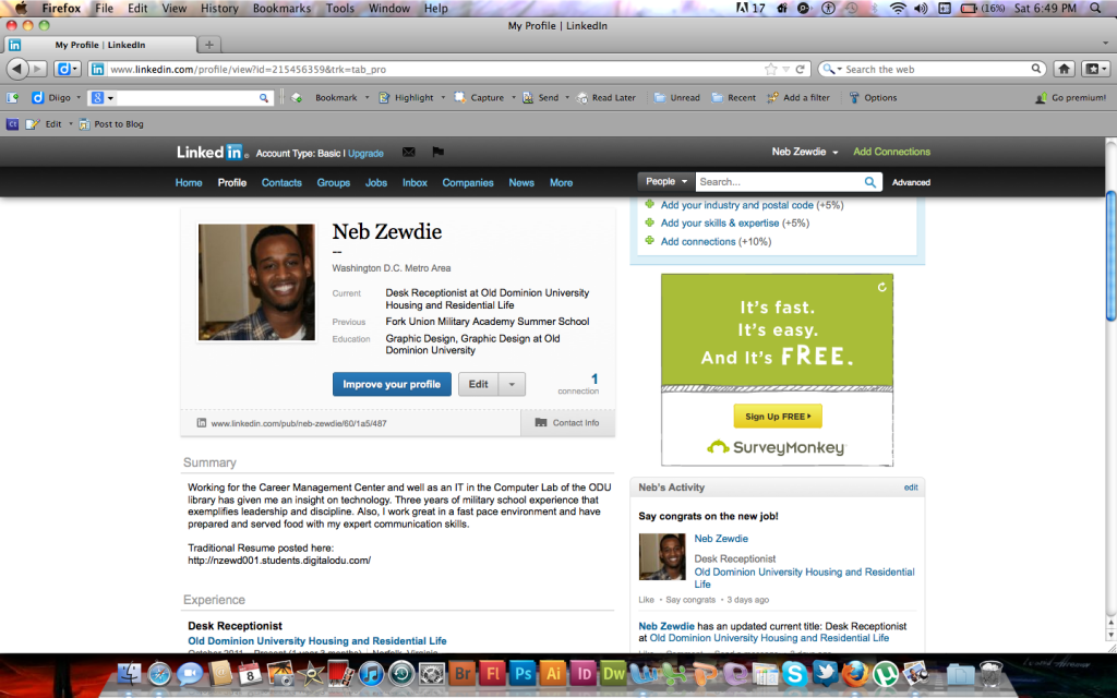
Image by LinkedIn.com

I feel that my LinkedIn profile has a great purpose of helping improve upon my professional online identity as well as improving my future career. Not only can it give me the opportunity of networking with other Graphic Designers but see how Graphic Designers are doing after college or after a certain amount of years. This could allow me to set goals for myself and see where I am in comparison to other designers. My audience is for anyone mostly for employers and businesses to see my credentials and decide if I am worthy of being hired or not. The purpose of my LinkedIn profile is to hopefully get me hired and understand my skills and abilities like my fellow peers in the field.

Rhetoric on the Town Website Analysis

The New York Times Website

The New York Times Website

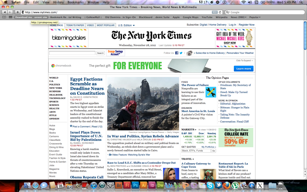
Rhetoric Analysis: The New York Times is one of the most well known newspapers in America. It’s website is just as popular maybe even more, being the number one visited newspaper website in the nation. This page is made for their audience which is all of America and its diversity along with it, therefore all kinds of people of different cultures and diversities visit this site looking for information on things going on in today’s world that they need to know or can relate to. At the top of the page you can select the language immediately as well as on side you can choose the categories all separated into different categories as well. Also, there are commercials on the site that appeal to the viewer based off of the viewers sites they visit often or subject/products they type in a lot.

Design Analysis: The design for the sight is very simple and well organized to help the viewer find what they’re looking for. There’s always a larger picture placed in the middle to state importance with smaller thumbnails that you can click on to go into further detail on subjects less important than the first article. The type for secondary headlines are blue, bold and large so you can easily pick out which ones you want to read with no struggle and the text underneath it is simply black and clear. The advertisements are placed strategically so that when you scroll down or read into an article or headline, your eyes are led into the advertisement itself allowing you to read everything and view the ads at the same time.

Design & Rhetorical Analysis: I feel as if the page did a great job design wise to meet the needs of the audience. The organized topics on the side and the language selection is definitely something they looked into when considering who is viewing their page and what they can do to keep them there rather than some other newspaper website. Although it is a newspaper website, and newspapers mostly appeal to an older crowd, we are a newer generation with more complexities. We actually involve ourselves in politics and whats going on in the world. The younger crowd is on the rise when it comes to being active in world information. Therefore I think more topics should be added to the list that appeal to youth as well as make the website less dull and add creativity to it, with colors and more personality from the writers and journalists themselves.

Copyright & Attribution: Each article has the writers name to give credit to the author that took time to write the article. When you click on the article, on the page it leads you to it will have the author’s name hyperlinked you can click on it and it will take you to a page about him or her. Also, at the very bottom of the page show the ownership of The New York Times Company to the website itself.


Project #3 Activity

For this project my video resume will be simple with some personality involved. I would like to use a map resume to help better explain the different aspect, qualities and skills I obtain. With a timeline, although it can be helpful I think it would be taking away from the point of who I am now and what I can do for the business now instead of explain my past and how I got to this point. I will be dressed professionally just as if I were walking into an interview, my voice will be clear, loud and ready to state my presence. I am making a video to be hired therefore I would not want my employer to be bored with what I am saying. I probably won’t overdo my resume with advertisement-like traits like my friend Dave here, but I will try and make things upbeat and be a little witty. I’ve been told to not be so serious sometimes when trying to be hired and that being friendly is a great way to have the employer on your side. I also want to stand up and use a black background to help me stand out more, anything to get the viewer or potential employers attention subliminally i will work. I want viewers to understand who I am as a person through my video professionally as well as take in a piece of me personally. Lastly, attached to my video will be my resume and my Linkedin profile and maybe some pictures of my work as of right now.

Project #3 Video Resumes: The Good, The Bad, and The Ugly

The Good: There are many good qualities of using a video resume. They are great ways to meet the client without having to bring them in for an interview and help manage time better for the employer. They are also an innovative and a new way to look at things when hiring or being hired.

The Bad: One of the things I don’t like about video blogging is that the employer might get the wrong idea about you through something you do in the video that you would be able to explain in reality. Also, the employer can turn off the video whenever if he or she likes, unlike a real interview where you get a fair share of their time.

The Ugly: Video resumes can also seem quite cheesy to me. Being that they lack the reality of someone’s presence I feel as if the employer might have a hard time taking this person trying to be hired seriously. It may come off as being too lazy to make it to an actual interview and even the person could seem unsocial.

Reply to Classmate: http://dsmit182.students.digitalodu.com/?p=355#comment-350


Fonts

Fonts are a great way to add personality to a page. The add depth and allow readers to become more interested in the subject of which the font is about. I think bold, italicized condensed fonts would definitely represent me well because I’m a outgoing a loud kind of guy and I think a font like that really stands out unlike a light, non-condensed, spaced font that screams no value. The book helped me a lot when thinking of a font that would represent me and I chose of course Antique Olive, and another great font I feel is identical to Antique Olive is Cooper Std Black.

Audio Postcard Project Reflection

http://youtu.be/ydfM7fN5noQ

Project Description

The audience is intended for anyone who is interested in Digital Writing or anyone who wants to be informed of what it is. Its purpose is well explained; to help people grasp that the internet and media aren’t just entities but are been created and revolutionized creations of humans to benefit our lifestyles. For the image of the audio postcard I selected the different hands going from human to technology, and I edited it simply by using the Photoshop Express site given to us. I lessened the contrast so you could see the detail as well as used warmer colors to help the viewer feel more comfortable and cropped the image a little bit just enough so you can view less extraneous details. In the audio it simply explains the details of digital writing to an audience that is unaware of what it could be. It breaks down with simplicity how it was created and what it is used for. I also used classical music to create an intelligent environment for the viewer and allowing the viewer to understand more clearly, because studies show that when classical music is played people have an easier time comprehending information. The image itself shows the rapid growth from man to technology and rhetorically explaining to viewers that digital writing is a revolution that will probably never come to an end. All of the hands within the picture are writing the same thing, “evolution.” This shows that we are evolving as humans and becoming more advanced in our culture. Also, I added more warmer colors to the picture rather than cold colors like blue so that the person watching the video felt comfortable rather than cold and separated from the information being told to them.

Reflective Letter

I am mostly proud about how clear my voice is with the classical music being played in the background. You can really hear each word I say with clarity and annunciation. I wish I had more time to go into even more detail about the information of digital writing. Although I did believe I broke it down pretty well, I think I left a couple subjects untouched. The technologies I used for this project were Audacity, iMovie, the Photoshop Express site, and YouTube. All of these resources helped me out perfectly and now I actually know how to create a personal movie of my own! The only parts I had trouble with really was working attaching the photo to the audio on iMovie and actually posting the video on YouTube because I wasn’t using the right files. I learned as a digital writer that a lot of the information we know doesnt necessarily have to be typed and posted but can be explained through video and can save a lot of time. One of the course outcomes I used in this project was Multitasking, I learned to use different technologies and simultaneously work on different parts of the project all at the same time. Another one I used was Distributed Cognition because I got to use different tools to help create this audio postcard and it will benefit me in the future that I now know how to use these different tools. Lastly, another course outcome I used was Appropriation. I had to remix the different medias of audio files and photos to create one whole video on a video sharing site called YouTube.

Rhetoric on the Town: Flow

Posted on OEMCentral.com

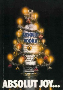
The purpose of this advertisement is to promote Absolut Vodka during Christmas time due to the reef wrapped around the bottle with the Christmas lights. The audience, of course, is intended to be people over the age of 21. What I love most about the ad is that the bottle is suppose to represent a Christmas tree to encourage drinkers to believe that it is the best drink to buy it during the holidays.

This advertisement has great flow because the lights and reef wrap around the bottle allowing viewers to read the text of the bottle and leading to the bottom of the advertisement that says, “Absolut Joy…” The audience can unknowingly enjoy viewing the bottle as a Christmas tree and will be excited to purchase the product.

Relflection on Rhetoric on the Town

My classmates opened my eyes to a different way of viewing advertisements. I would look at the ads before I read their posts so I can analyze them myself. Although my opinions were well thought out my classmates elaborated on several different areas of alignment, contrast, and balance that I probably would have not noticed without their informative Rhetoric on the Town posts.


Alignment

http://mblac018.students.digitalodu.com/?p=137#comment-241

http://jcher021.students.digitalodu.com/?p=116#comment-156

Contrast

http://www.lglos001.students.digitalodu.com/?p=113#comment-163

http://mquer005.students.digitalodu.com/?p=129#comment-159

Balance

http://vsimo001.students.digitalodu.com/?p=162#comment-120

http://dsmit182.students.digitalodu.com/?p=222#comment-130


Searching Myself Online

It was interesting at the results that came up on Google when I searched my name under Neb Zewdie. Obviously, its not a common name so everything was pretty much there, even from my high school days. First thing that came up was my Yahoo Sports profile made my junior year when I was playing football for college scouts to recruit me. Next was a new account I made about a month ago for Instagram. I don’t mind it but I think I might want to make it private as well as my other social networking accounts. It surprised me a little to find my old MySpace account still at number three. Its not really something I like to brag about because its actually slightly embarrassing, which might motivate me to delete it soon. The next couple are more recruiting sites from my high school football career including MaxPreps and BeRecruited. There’s is also my account for MileStat which had all my track and cross country information and stats. If you go through a couple more pages you can find a YouTube video my friend posted of me from my freshman year acting ridiculous! After page 4 or 5 other people start showing up and it becomes less definitive but overall I am partially content knowing that I am a well known person who partakes in different activities that show online, but also on the other hand I am a little worried about all the social publicity in case I would like a job in the future. I almost got in trouble with my job last summer from social networking so I might tone it down soon.

Project #3

When I grow up I want to be a professional Graphic Designer. I really want to go into this career field because my talents as an artist and interest in new technology combine to open up a job opportunity with a good pay. I’ve worked with art all my life which allows me to easily understand the subject and create great designs as well as my love for technology. Although, I’m not the most tech savvy person in the world, I believe my interest and curiosity and willingness to learn the interesting new technology available make up for it. I love being able to create something with my own mind and being able to portray it on any different kind of media and having it appeal to people and catch their attention. A design is made to ignite the senses and make viewers interested in whatever you are displaying for them, whether it is a design for a company to promote their product or a design to display a movie or album of an artist.