Relflection on Rhetoric on the Town

My classmates opened my eyes to a different way of viewing advertisements. I would look at the ads before I read their posts so I can analyze them myself. Although my opinions were well thought out my classmates elaborated on several different areas of alignment, contrast, and balance that I probably would have not noticed without their informative Rhetoric on the Town posts.


Alignment

http://mblac018.students.digitalodu.com/?p=137#comment-241

http://jcher021.students.digitalodu.com/?p=116#comment-156

Contrast

http://www.lglos001.students.digitalodu.com/?p=113#comment-163

http://mquer005.students.digitalodu.com/?p=129#comment-159

Balance

http://vsimo001.students.digitalodu.com/?p=162#comment-120

http://dsmit182.students.digitalodu.com/?p=222#comment-130


Searching Myself Online

It was interesting at the results that came up on Google when I searched my name under Neb Zewdie. Obviously, its not a common name so everything was pretty much there, even from my high school days. First thing that came up was my Yahoo Sports profile made my junior year when I was playing football for college scouts to recruit me. Next was a new account I made about a month ago for Instagram. I don’t mind it but I think I might want to make it private as well as my other social networking accounts. It surprised me a little to find my old MySpace account still at number three. Its not really something I like to brag about because its actually slightly embarrassing, which might motivate me to delete it soon. The next couple are more recruiting sites from my high school football career including MaxPreps and BeRecruited. There’s is also my account for MileStat which had all my track and cross country information and stats. If you go through a couple more pages you can find a YouTube video my friend posted of me from my freshman year acting ridiculous! After page 4 or 5 other people start showing up and it becomes less definitive but overall I am partially content knowing that I am a well known person who partakes in different activities that show online, but also on the other hand I am a little worried about all the social publicity in case I would like a job in the future. I almost got in trouble with my job last summer from social networking so I might tone it down soon.

Project #3

When I grow up I want to be a professional Graphic Designer. I really want to go into this career field because my talents as an artist and interest in new technology combine to open up a job opportunity with a good pay. I’ve worked with art all my life which allows me to easily understand the subject and create great designs as well as my love for technology. Although, I’m not the most tech savvy person in the world, I believe my interest and curiosity and willingness to learn the interesting new technology available make up for it. I love being able to create something with my own mind and being able to portray it on any different kind of media and having it appeal to people and catch their attention. A design is made to ignite the senses and make viewers interested in whatever you are displaying for them, whether it is a design for a company to promote their product or a design to display a movie or album of an artist.

Rhetoric on the Town: Alignment

Posted on eHow by Break the Silence


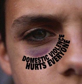
This advertisement can relate to anybody in relationships or in a marriage. Being that the person with the black eye in this ad looks young they may be aiming for a younger audience around 16-21. That way people understand at a young age that domestic violence is wrong and as they grow up they will know that instead of discovering it too late. This image is telling people that if you are in an abusive relationship that it won’t just hurt your relationship with that significant other but other people like your family and friends as well as the victims family and friends too. I believe that this ad is using alignment of the words to focus readers eyes on the black eye it is surrounding. Doing this makes the viewer look directly at the black eye instead of anything else first. It places a significance around the eye and forces viewers to know that the black eye is the subject of this advertisement. The advertisement uses great alignment for the audience to clearly recognize the purpose of this image.

Rhetoric on the Town: Contrast

Posted on Designing Mail by iPod ad


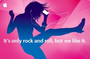
The purpose of this advertisement is to relate to people who love to listen to music and love to dance. There is an obvious silhouette of a person dancing while listening to an iPod indirectly stating that if you get the iPod then it would make you want to dance like that too. The audience would most likely be to teenagers and young adults who love to enjoy music and live a life filled with it. The advertisement is making it saying, “It’s only rock and roll, but we like it.” using rock and roll as a genre most youth can enjoy and saying “we” to make it seem like they are part of the audience they’re trying to advertise to. Contrast definitely plays a big role within this advertisement because it uses contrasting colors to make bold statements that appeal to the eyes of readers and force you to look at it. Rock and roll is loud and can be considered a bold genre which relates to the colors of the advertisements being bright and loud itself. Also, many young adults are attracted to strong bold colors as well that are seen in the iPod advertisement.

Individual Reflection: Project 1

For my wiki page “Old/New Media,” I contributed several different things to help establish a better page. I started with adjusting the words and lettering to match everyone else’s pages so the pages wouldn’t seem so random and different from each other. For the information, it was already done perfectly and gave a clear elaboration on the subject so I pretty much just edited a few things and switched around the words to help explain it better. Overall I believe my contribution to the wiki page made a good impact and allows readers to easily understand the subject.

What I’m mostly proud about with the wiki in general is the way we organized it. It’s simple and easy to use not just for Digital Writing student but for anyone who knows how to use the internet. For my contribution I believe I mostly proud about having made the page similar to its other page and not having it confuse readers because the focus is on making readers feel comfortable and wanting/willing to read the wiki page. I think my most troubling part of the wiki site other than not being able to log in is knowing how and where to separate the different points within the subject and still establishing a connection between them. As a collaborative writer I discovered that every other person’s contribution is vital for the material because different people have different view points on any subject. Collaborative Intelligence was one of the first course outcomes I believe was significantly improved by working with all of my classmates to create this informative wiki site. Another course outcome that was improved was networking, there was several situations where I’d be asking advice from website designers to improve on this wiki site and even my well informed classmates to better the project. I believe appropriation because a lot of our videos and pictures were samples from different parts of the web that we used to benefit our project. Lastly, I feel that the course outcome of play was improved exponentially out of all of them because the whole time what we were doing was experimenting and exploring the wiki page, problem-solving in the process as well.

Rhetoric on the Town: Balance

This Heinz advertisement is trying to show that Heinz ketchup is made from the freshest ingredients that is basically is like fresh sliced tomatoes. The audience can clearly see fresh tomatoes that will appeal to them rather than a ketchup bottle they know is made artificially. I believe that this advertisement depicts balance perfectly. The distorted ketchup bottle is placed in the center and although the bottle is shown as cut up tomato slices it still finds a way to seem as if the tomato slices are all balancing on each other. It definitelymeets the needs of the audience who are always looking for fresher, less artificially processed condiments.

Creative Commons lincensed images for Project 2

Image 1: This is an image of three hands writing the word “evolution” with each arm being more and more robotic.

Image from: Samuel Parent’s Blog

I feel like I really want to use this photo because it focuses on humans going from writing by hand to finding new technologies and different medias and social networks to express themselves which is digital writing itself. I want to fix up this photo by maybe cropping the bottom slightly so that the hands look more seperated. and also maybe darken the photo because some of it is a little washed out from the light. I will be using this all with Photoshop.


Image 2: This is an image of what an artist believes to be a digital world or realm that has an endless path into a light.


Image from: Deposit Photos

Rhetoric on the Town: Chapter 8 (Images)

Images are half of the media we work with now a days along with text, it does just as much justice placing a photo as would reading an article. Images help explain things that words or authors can’t explain, and they help emphasize what the writer has to say as well. They are extremely powerful having the ability to enhance a reader’s interest or distract them.There are many things you can do to photos to keep it from distracting the reader in general. Like cropping, partially and fully silhouetting, vignetting and so much more. Fully silhouetted photos help add interest to the page by making it feel as if the image is actually within the page itself instead of wherever the photo takes place in. But also, at the same time regular photos or even cropped photos with a background help to lead the reader to believe he or she is looking into a completely new world.

Rhetoric on the Town: Chapter 6 (Repetition)

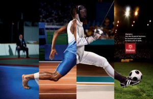
In Chapter 6 we read about how repetition plays a huge role within the design aspects of digital writing and media. In this advertisement, “Bradesco” wants to appeal to an audience of athletes of more than one sport. They are trying to say that any kind of athlete can use their products. Also, i think that they are trying to say all athletes are the same in that they all need to use their product. Although I believe it does a great job in grabbing a certain audiences attention I don’t believe it helps the product or business itself because from what I looked up it seems to be a Spanish Bank. Maybe there is a deeper meaning behind the advertisement that I can’t understand because of the language barrier.


Image from: Apps Log